Hi Sylvain,
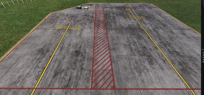
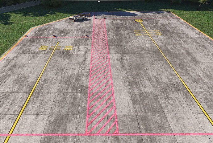
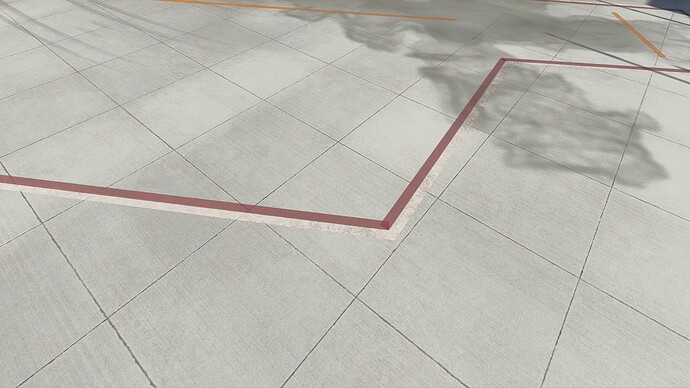
First, I’m wondering what references they collected? Did they go out in the field and color match the materials. If they used photographs, I assume you’re all aware of how badly photographs reproduce red? I would never, ever, ever trust a red I see in a photograph. I mean, I know you all are extremely aware of lighting and colors. So how this squeaked through I’m not sure? That image you’re showing looks bad (and @matheof 's even worse). The red lines I’ve seen at airports are not even close to the lines you’re showing in your screen capture. In real life, they’re red, and and they’re shade changes depending on how old they are, typically getting darker I think? True, those look as though the sun is brightening the lines based on how the light is reflecting, but they’re much pinker than I’ve ever seen at any airport. But shouldn’t the color be controlled by the shader and not by the color of the material? Maybe that’s what you’re saying? Maybe it’s because of the sunlight and your shaders are changing it from the color we’d see from close up.
Be that as it may, Matheof’s photo from his 2020 asset in 2024 looks absolutely horrendous… which brings us to the second point…
I think @Matheof is pointing out that a 2020 airport being used in 2024, the red lines are that horrible pink when the asset is brought into 2024…eek!
I haven’t checked my own 2020 airports out in this regard, but I certainly hope that’s not what they look like. So, secondly, 2020 airports are supposed to look in 2024 like they do in 2020. I know you know we have to go back to 2020 to edit them. How are we supposed to know what color to choose if they look different from one to the other? Point being, we were told 2020 airports would look the same in 2024 as they do in 2020. And what you’re saying here is that that is not the case? What other changes like this have been made? Are they all compiled somewhere so we can go back and edit all of our assets to fix all these things? Really, I hope not. It’s one thing to change things for future assets, but, we were told that our 2020 assets would be compatible across the board. I don’t want to go back to every single one to make them compatible when we were told we wouldn’t have to do this.
And third, really, if I can, I’d prefer to use default colors for consistency’s sake than create my own custom colors, that are going to be different from everybody else’s. The more default colors I can use the better as far as I’m concerned. Not only that, custom materials are yet again another time sync, I’d rather just depend on the default materials.
Please, please bring back red lines. They shouldn’t be pink. For compatibility, obviously, it’s ok to create new stuff, but not to change old stuff. Or, if you have to change old stuff, for whatever reason, to create all that extra code necessary to slip in the old stuff when required (which of course we all hate to see). Personally, in this case, if you all really, really think it was important to change a default like this (it wasn’t in my opinion, but that’s neither here nor there), please just add it as a new option to choose, then we can decide which we like better. Now we have to decide if we should edit all of our old assets or just bin them and take them out of circulation. That’s really sad. I used Slim_Red all the time, and now I have to go back and check if they look like @matheof 's.
Realizing this is “By Design”, how do we submit changes we’d like to see for “By Design” issues which we’d like to see changed (in this case, back to what it was)? I think typically a "By Design issue is binned and therefore the information stops there?
