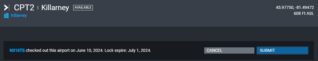
This is an airport page:
This is the modal dialog box for submitting an airport:
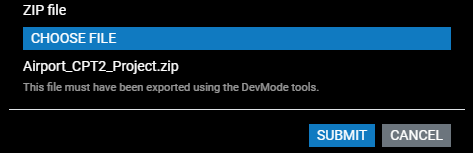
Notice how the Submit and Cancel buttons are swapped on these two pages?
When building a UI, you always want the buttons to be in the same order, with a consistent color scheme and wording. In Windows, most dialog boxes have the OK button on the left and the cancel button on the right. So, my opinion is that the best way to fix this is to change the airport page so that the Submit button is on the left and the Cancel button is on the right.